esiil data course
The following plots are assignments created as assignments for the 2026 ESIIL Data short course!
First, I created an interactive map of the CU Boulder campus using Open Street Map and Python code.
I then used what I learned to create a map of my hometown, colored with the shades of the Camas Lily, the flower the city is named after.
Next, we used NOAA NCEI data to create interactive time series of annual mean temperatures from a weather station near Boulder, CO.
I then repeated this for a weather station near the Bull Run Reservoir in Portland, OR.
Finally, we learned how to use NDVI data to perform basic vegetation analyses! Here is a plot of the NDVI change in the Tubarjal Valley of the Al Jawf region of Saudi Arabia.
And here is a time series of the vegetative pixels in the same region!
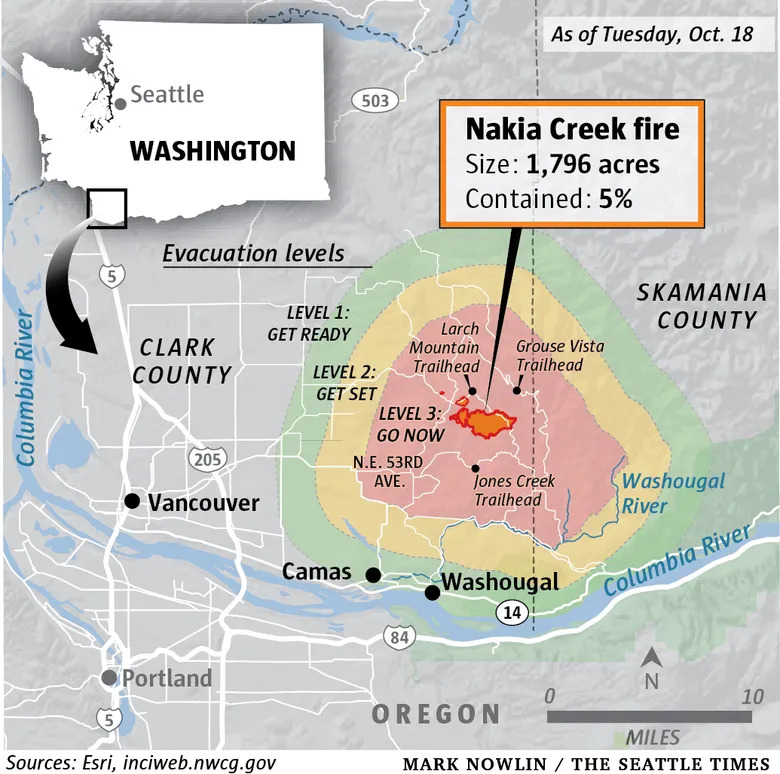
I then repeated this for Clark County, WA, where I grew up. I was curious if the 2022 Nakia Creek Fire would have an impact on the NDVI in the county.
See that pinkish patch on the lower right side of the map? If we look at a map of the fire, provided by Seattle Times, we can see that it lines up with the location of the fire, showing it had an impact on the NDVI observations from space!
I then created the following time series, which shows that across the 6 study years, the 2022 fire didn’t have the largest impact on NDVI! The biggest declines were in 2021, likely due to urbanization/developments.